September 30, 2024
The Bitcoin bet that left Wall Street in its dust
Dear Reader,
August 11, 2020.
MicroStrategy announces its first Bitcoin purchase.
It would prove to be the first of many. The company now holds more than quarter of a million BTC.
Nobody at the time — save for the company’s then CEO, Michael Saylor — would have predicted the seismic shift it would trigger in the company’s fortunes.
Four years later, let’s see how this particular Bitcoin bet has played out.
David vs. Goliath: MSTR takes on the S&P 500
Since that fateful day in August 2020, MicroStrategy (MSTR) has embarked on a journey that would make even the most bullish tech investors blush.
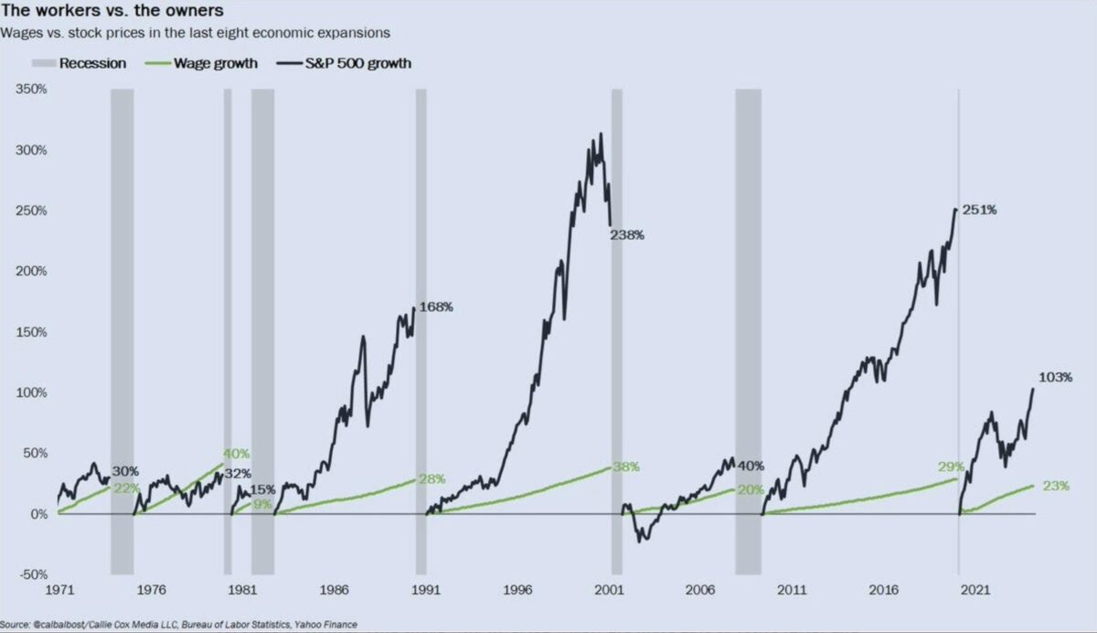
While the S&P 500 has delivered a respectable 70% return over this period, MSTR has gained 1,071%.
Check it out:
Let that sink in for a moment.
While the broader market was busy navigating pandemic recovery, inflation fears, and geopolitical tensions, MicroStrategy was quietly (or not so quietly) outperforming nearly every other stock in the index.
The numbers don’t lie
At the time of writing, MSTR is trading at $165.98, up 9.24% in a single day.
Compare this to the S&P 500’s current level of 5,648.40, which represents a 25.31% increase over the past year.
MSTR performance over the past five years
MicroStrategy’s market cap is $30.37 billion.
The company’s 50-day moving average price is $142.38, while its 200-day moving average is $120.86.
MSTR’s trading volume has exploded, with 16,889,560 shares changing hands compared to an average volume of 11,784,407.
These figures paint a picture of a stock that’s not just growing but accelerating.
Driving this acceleration, of course, is the company’s massive Bitcoin holdings.
As of the latest reports, the company holds 252,220 BTC, purchased at an average price of $39,456.
This translates to an unrealized gain of 61.92%, or $6.1 billion.
It’s worth noting that while MSTR has outperformed Bitcoin itself (which is up 425% since 2020), it’s the company’s leveraged position that has amplified these gains for shareholders.
It’s also worth noting that Saylor regards the basic strategy as something anyone can replicate:
MicroStrategy’s performance becomes even more impressive when we stack it up against the tech giants that typically dominate market discussions.
Since August 2020, MSTR has outperformed the ‘Magnificent 7’ — Apple, Microsoft, Alphabet, Amazon, Nvidia, Meta, and Tesla.
MicroStrategy currently ranks 306th in terms of market capitalization among publicly traded U.S. companies.
This puts it squarely in the middle of the S&P 500 pack, despite its outsized returns.
Entering the S&P on the back of buying BTC?
With such stellar performance, why isn’t MicroStrategy already part of the S&P 500? The answer lies in the index’s stringent inclusion criteria.
To be considered, a company needs:
- A market cap of at least $11.2 billion — check.
- 50% of stocks in free circulation — check.
- A ratio of annual turnover to market cap of at least 0.3.
- Monthly traded value higher than 250,000 shares for six consecutive months.
MicroStrategy’s focus on Bitcoin and its issuance of convertible bonds have been hurdles. However, come January 1, 2025, new FASB rules on digital asset holdings could change the game.
If MSTR reports positive earnings on October 29, 2024, it could be a strong contender for S&P 500 inclusion, potentially adding $3 billion to its undistributed profits.
Flash in the pan, or new paradigm?
The company’s strategy is high-risk, high-reward, tying its fortunes closely to the volatile cryptocurrency market.
But, MicroStrategy’s journey since August 2020 has been extraordinary. Its 1,071% return has left the S&P 500’s 70% gain in the dust, challenging conventional wisdom about corporate treasury management and investment strategies.
The question now: Is MicroStrategy a outlier, or a harbinger of a new era in corporate finance? Time will tell, and Wall Street will be watching closely.
Just this month, Saylor announces MicroStrategy had scooped up another batch of BTC:

Michael Saylor⚡️
@saylor
MicroStrategy has acquired 18,300 BTC for ~$1.11 billion at ~$60,408 per #bitcoin and has achieved BTC Yield of 4.4% QTD and 17.0% YTD. As of 9/12/2024, we hodl 244,800 $BTC acquired for ~$9.45 billion at ~$38,585 per bitcoin. $MSTR https://www.microstrategy.com/press/microstrategy-acquires-18300-btc-achieves-btc-yield-of-4-qtd-17-ytd-now-holds-244800-btc
microstrategy.com
MicroStrategy Acquires 18,300 BTC and achieve…
MicroStrategy Acquires 18,300 BTC and achieves BTC Yield of 4.4% QTD and 17.0% Y…
2:7 PM • Sep 13, 2024
4794
Retweets
27385
Likes
Read 1745 replies
Run an SMSF? New video for you:
Managing an SMSF can be painful, or it can be easy.
Navarre’s latest walks you through how to make it the latter.
Click to watch.
That’s it for The Benchmark this week.
Forward this to someone who’d enjoy it.
If one of our dear readers forwarded this to you, welcome.
Invest in knowledge,
Thom
Editor, The Benchmark
Unsubscribe · Preferences
All information contained in The Benchmark and on navexa.io is for education and informational purposes only. It is not intended as a substitute for professional financial or tax advice. The Benchmark and any contributors to The Benchmark are not financial professionals, and are not aware of your personal financial circumstances.


