In October 2023, we unveiled a major new update to the Navexa Portfolio Tracker. Here’s an explainer on the key changes.
Navexa started life as a basic portfolio tracking tool. Today, it’s developed into a multi-asset, multi-market platform that gives investors professional-level portfolio tracking and analysis on a level no other tool can match.
In October 2023, we launched the most advanced iteration of Navexa to date. In this post, we explain the changes and walk you through a few of the powerful new tools we’ve created to make understanding and optimizing your investments easier than ever before.
Watch our Navexa 3.0 Webinar
We revealed and explained the latest iteration live on a webinar for our customers. Watch the replay free — just click the player:

Navexa 3.0: The Philosophy Behind The Redesign
Navexa started life in 2018 as a basic portfolio tracking tool. It quickly evolved, supporting more markets and offering more solutions to the all-too-common problems investors encounter trying to accurately track and analyze their long-term investment performance.
Today, we’re shedding our reputation as ‘another portfolio tracker’ and revealing four big new changes and additions to our platform.
Here, we introduce and explain the key new tools and updates, and show you why Navexa now offers performance tracking and portfolio analysis tools distinctly different from other platforms.
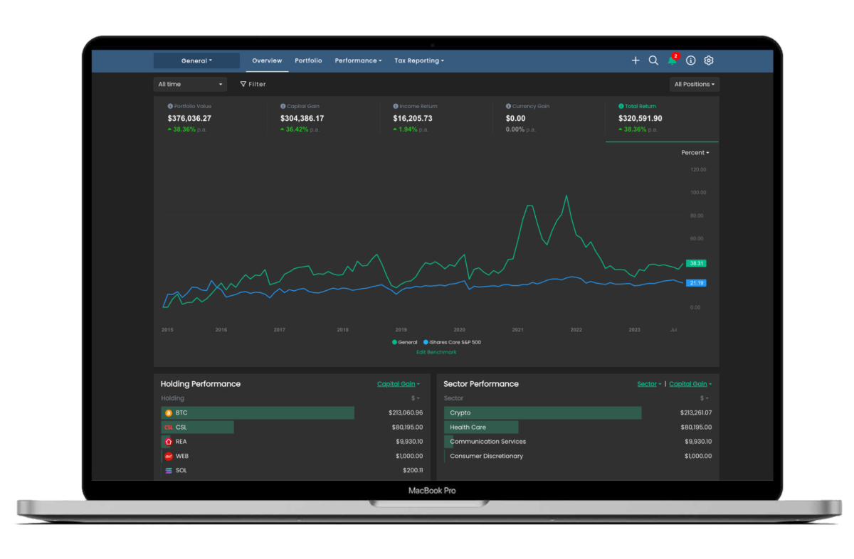
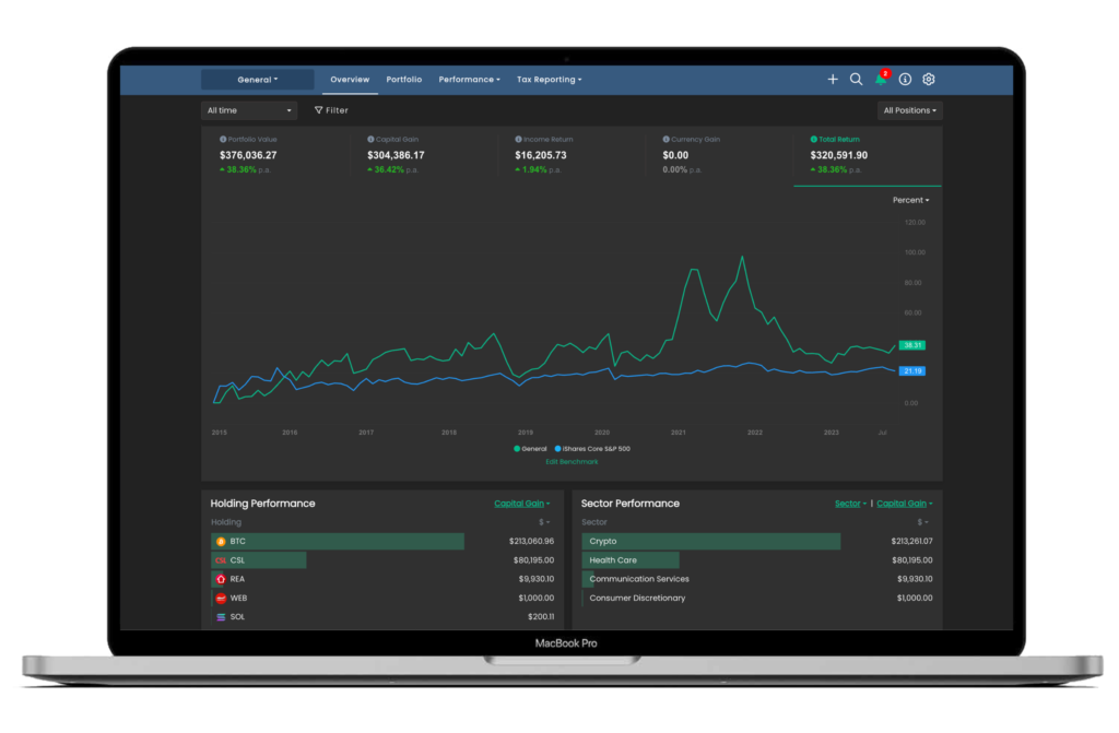
New: Portfolio Overview Screen
The most visible update we’ve made to Navexa is the new Overview screen:
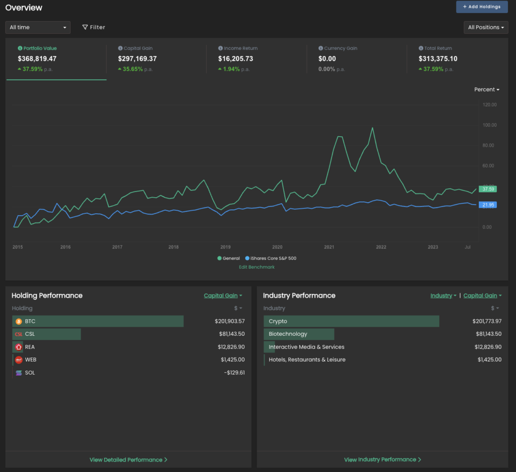
The idea behind this screen is that investors can see all their key portfolio performance metrics at a glance in one place.
While previously (and on other platforms) you needed to visit different parts of your account to find everything you might need to know, the new overview is effectively a one-stop shop for checking your portfolio’s vitals.
The five key metrics at the top of the chart (value, gain, income return, currency gain and total return) are now clickable — clicking each will display a chart for that specific metric.
Below the chart, you’ll find four bar chart panels.
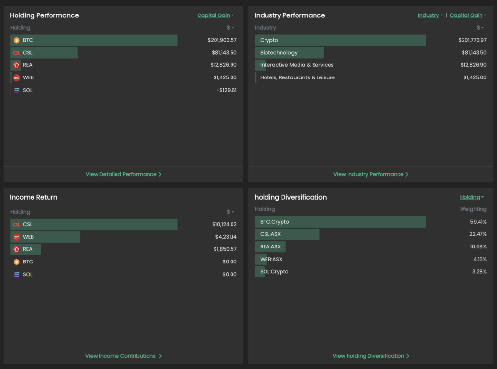
Clockwise from top left:
Holding Performance: A list of the top performing holdings in the portfolio.
Category Performance: A list of the top performing sectors in the portfolio.
Diversification: Select from holding, exchange, sector, industry and currency to view the portfolio’s diversification.
Income Return: A list of the highest income-earning holdings in the portfolio.
The first three panels all have clickable dropdown menus. You can customize what they show, like return, value, dollar or percentage.
This screen lets you both understand your portfolio performance at a glance, and allows you to drill down into greater detail. Just click the bottom of each panel to access the corresponding report based on your settings.
New: Filtering System
A key tool in Navexa 3.0 is the filter system.
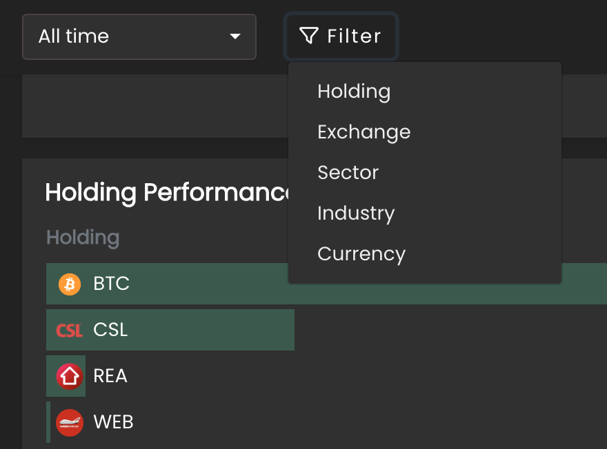
This small, but powerful, tool allows you to ‘filter’ what you view throughout your account.
Click it and select from the dropdown (holding, exchange, sector, industry, currency). This will prompt you to make a selection.
Once you choose your filter, your account will reload, and all the charts, metrics and reports will apply only to your selection.
Note: Your filter selection remains as you move throughout your account — you’ll see it above the chart, and can click the ‘X’ to remove it and revert to an unfiltered view.
New: Benchmark Analysis
You’ve long since been able to choose your portfolio performance benchmark in Navexa.
But whereas previously, this was a simple addition to the main portfolio performance chart, we’ve now created a new Benchmark Analysis page:
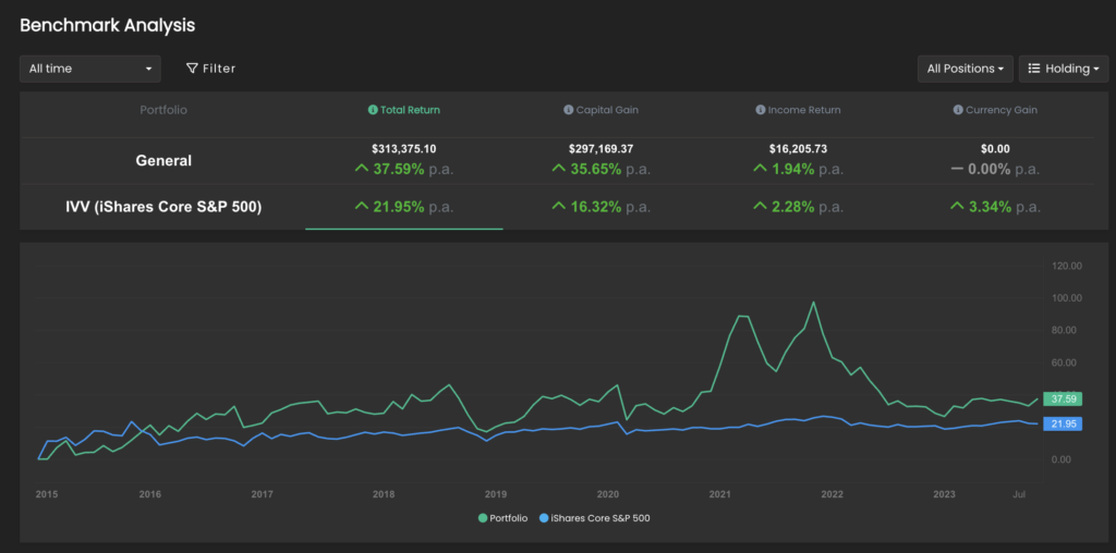
Like the Overview screen, the Benchmark Analysis chart features clickable metrics along the top. Click each to view the corresponding performance chart and benchmark chart together.
You can edit the benchmark both on this page and on both the Overview and Portfolio screens.
Below the chart, you’ll find two panels with bar charts:
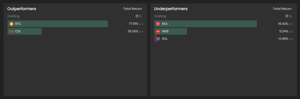
These display which holdings (or sectors, exchanges, currencies, or industries) are overperforming and underperforming relative to your selected benchmark.
New: Income Calendar
We have another cool new tool for you — the Income Calendar.
Where previously Navexa could only forecast confirmed upcoming dividends, the new Income Calendar lets you estimate portfolio income 12 months in advance.
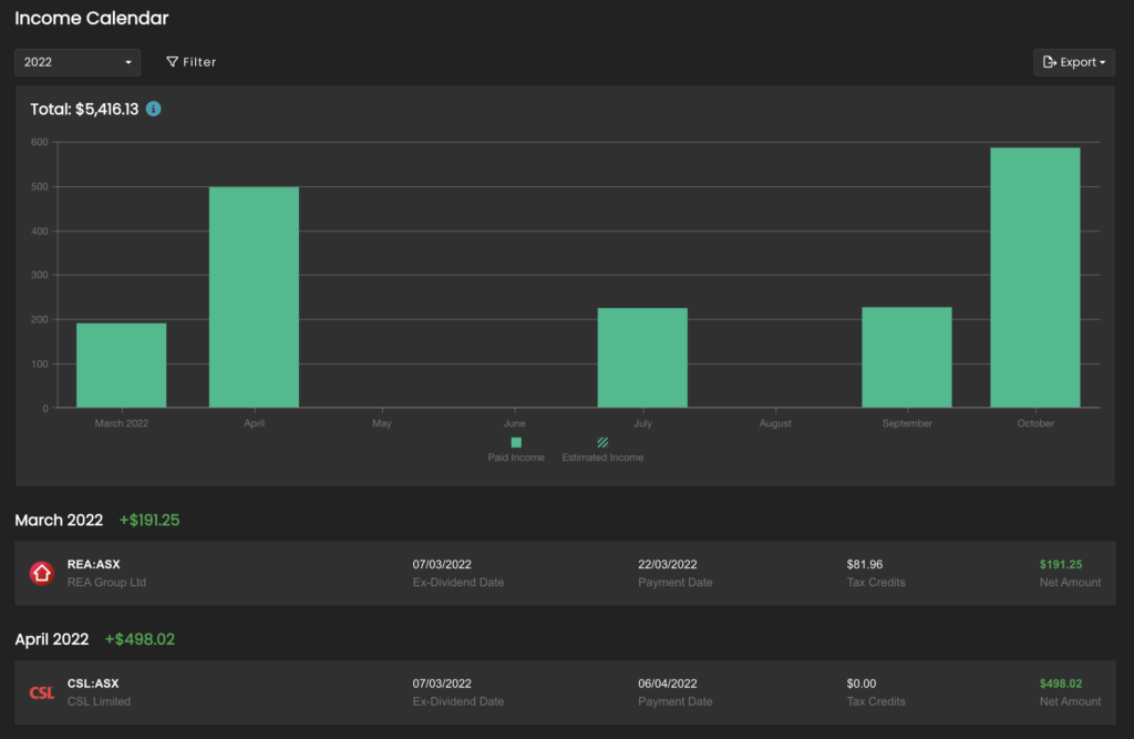
The solid coloured bars represent confirmed income, and the shaded bars represent predicted, or forecast, income.
Navexa calculated the predicted income based on the previous year’s earnings.
Below the chart, you’ll see a list of holdings and income ordered by date.
More New Stuff: Charts, cash account options & more!
We have left no stone unturned in this latest big upgrade.
You’ll also now find a Sankey chart for analyzing your portfolio income, the option to rename cash accounts, a slew of UX improvements (like labelling, and switching between showing open or closed positions).
Navexa 3.0 is live now — start tracking today!
Ready to start tracking and analyzing your portfolio?
Start tracking with Navexa today.